Clearcover Choice
Tools Used: Figma, Mural, Jira, UserTesting
Client: Clearcover
Research Methods: Competitive Analysis, Moderated Interviews, Unmoderated and Moderated Usability Testing, and Concept Testing
Role: Senior Product Designer
0 to 1 Product
When I joined the Choice product team, we had plans to build a proof-of-concept for a new product offering. We were looking to concept a consumer-facing auto quoting experience that could be plugged into third-party websites, like a car dealership’s buying experience, for quick quotes when consumers need it the most. The Choice product could either be white-labeled to match the client’s branding but underwritten by Clearcover or use Clearcover branding as a trusted partner.
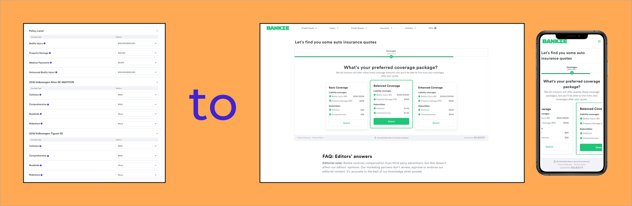
To test our white-labeled experience, we made up a fake company, Bankie, to use in prototyping and testing.
The Team, My Role, and Process
I worked closely with a small UX team within our product team (one Researcher and one Content Strategist). As we worked together to create the flow and visuals of the proof-of-concept, the engineers worked out the details of the back end.
It was important to me that we start with some desk research. The researcher took some time to review previous research studies from our Clearcover self-service quoting flow, and I worked on a detailed Competitive Analysis. We knew from meetings with our business partners that we wanted this new product to serve customers with multiple quotes from different insurance carriers if possible, so I took a look at other insurance aggregator sites, like The Zebra and Experian.
I wanted to use our self-serve flow as a start because the engineers had the back-end and front-end built, so we could very quickly get this new quoting flow built from that. However, we knew that we wanted to update a few things based on my Competitive Analysis and the researcher’s previous studies’ review.
Problem to Solve
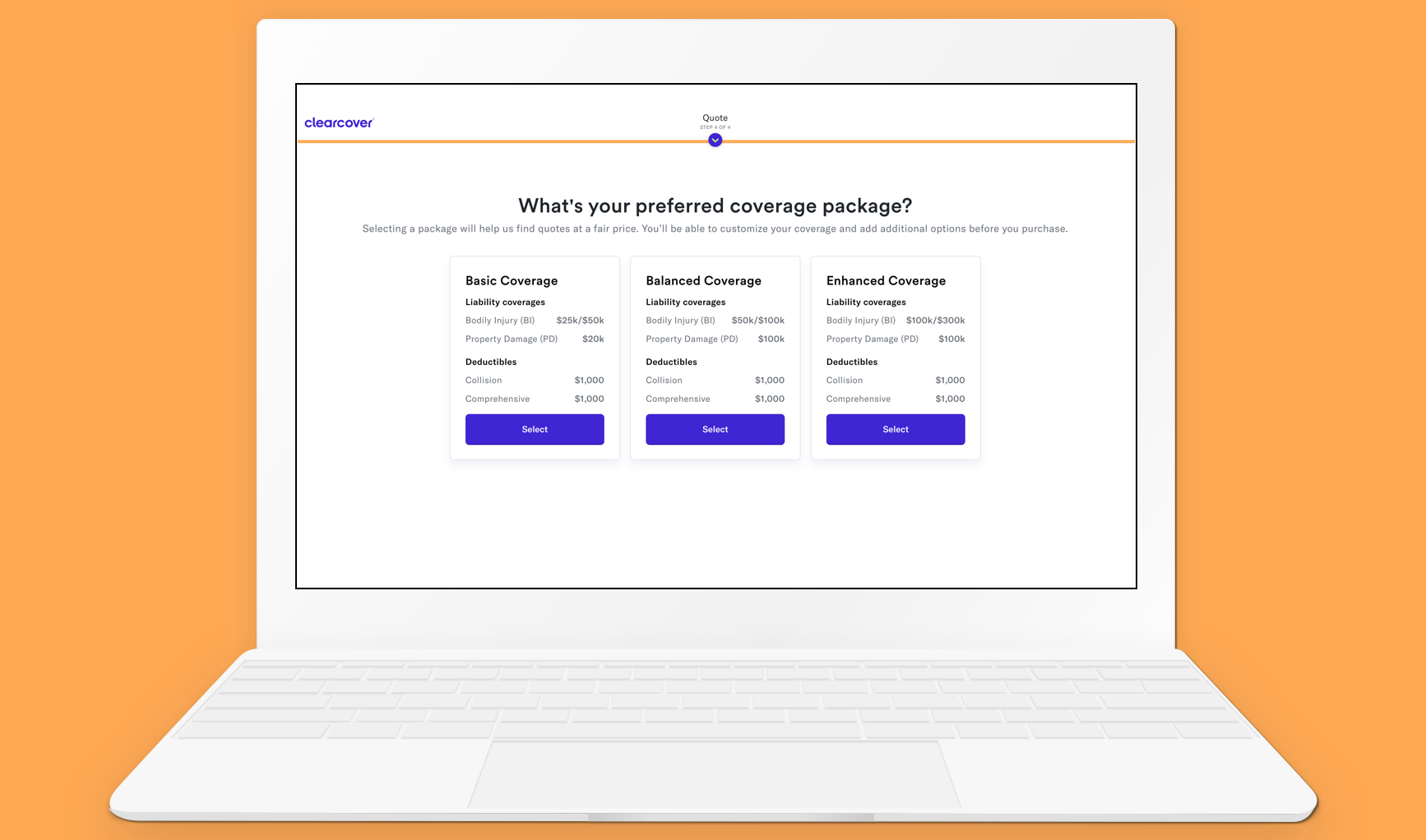
Going into designing the first prototype for testing, I knew that one of the biggest pain points in our self-service flow was customers being asked to select their individual insurance limits and coverages. Customers were often overwhelmed with the number of coverage opinions they had to make a selection for or didn’t understand what specific coverages were. Their goal was to get a specific tier of coverage: “basic, good, or full.”
I wanted to try matching our UI to what customers discussed in interviews, needing basic, good, or “full” coverage. We tested multiple iterations of the package names and worked closely with the Legal team to land on Basic, Balanced, and Enhanced.
Participants in testing could distinguish the difference between the three packages and were happy to see some of the most important coverages laid out on the cards, such as bodily injury, property damage, collision, and comprehensive coverage limits.
Designing Net New
Along with the questionnaire flow and Coverage packages screen, I was also working to design a new net carrier option screen.
How might a customer review the various carrier options based on their auto insurance needs and coverage selection?
We tested multiple options for this final step in the flow and learned through iterative testing what was most important for users to see when trying to make a carrier selection.
What was important for users to see before purchasing an auto insurance policy?
Price
reviews
detailed coverage information

The MVP Solution
We released our first solution in April 2023 and began using a launch-and-learn approach to improve the experience. Still, we felt confident in our MVP because it had been iteratively tested from the very beginning. As a team, we designed and built a product we were proud of, and our business partners could advertise and acquire partnerships with using this fully functioning MVP.
